|
For the Color Names assignment, I was asked to display 15 individual colors using the RGB value (in decimal notation) and the hex code. For the Color Schemes assignment, I had to create four different color palettes: monochromatic, analogous, complementary, and triadic, using the Abobe Color website. In Graviit, I used the fill tool and the shape tool to create my artwork. Through this assignment, I learned about how different colors can complement or contradict each other, and about the different degrees of primary colors that make up all existing colors. Color Names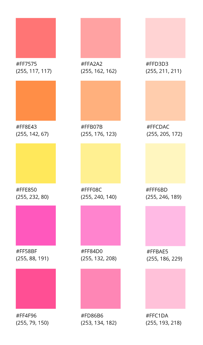 Color Schemes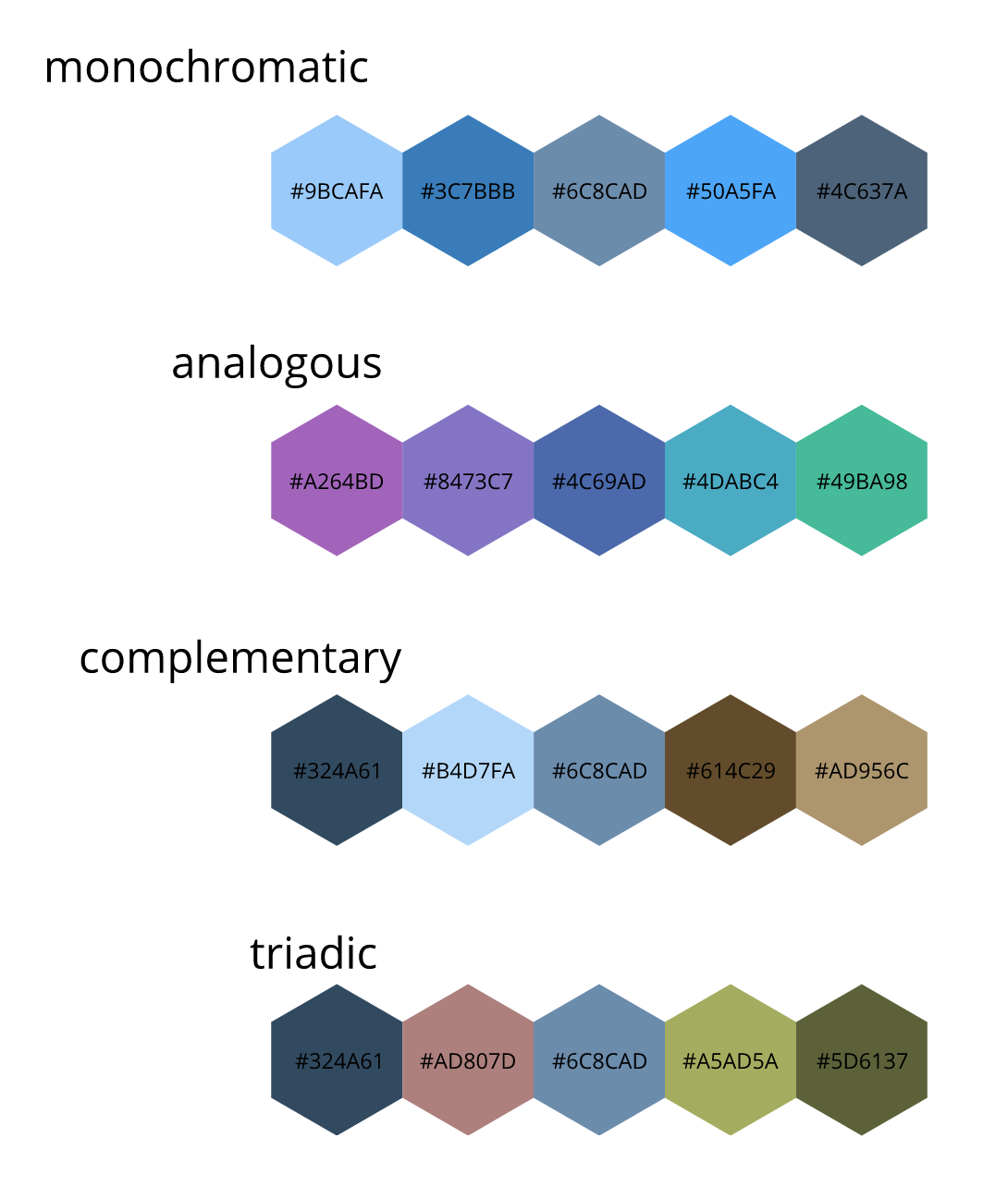
0 Comments
Typography is the use of text to convey different ideas. Typography is important because it can help make an idea or a tone of voice of written words clear through the visuals of the fonts. The quote, "Each font has a personality and a purpose " means that each type of text can be representative of a certain message and matches certain words more than others. We learned about the 5 fonts: serif, sans serif, monospaced, script/handwritten, and display in class. Serif has feet and is used in large blocks of text. Serif is commonly used in print. Sans serif does not have feet, and is often used on the web for headlines, titles, and smaller chunks of text. Monospaced is a font where each letter takes up an equal amount of space, and is used in coding. Script, or handwritten, is in cursive, calligraphic, or handwritten, and is good for logos, large headlines, and. details. Lastly, Display is any type of text that is good at grabbing your attention, and is used sparingly. Typeface ComparisonFor the typeface comparison assignment, we had to display a word or phrase using one of each of the 5 fonts: serif, sans serif, monospaced, script, and display. We also had to incorporate contrast, repetition, alignment, and proximity in order to make our words clear to read. 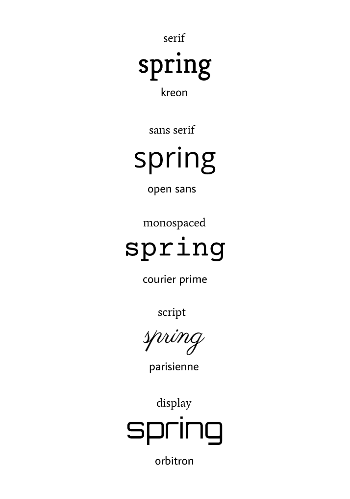 Word PortraitsFor the word portraits assignment, we chose ten different fonts, each with a different "personality and purpose." We had to write one word, with each of the fonts that we chose, that matches the voice of the font, and one word that does not match the font. 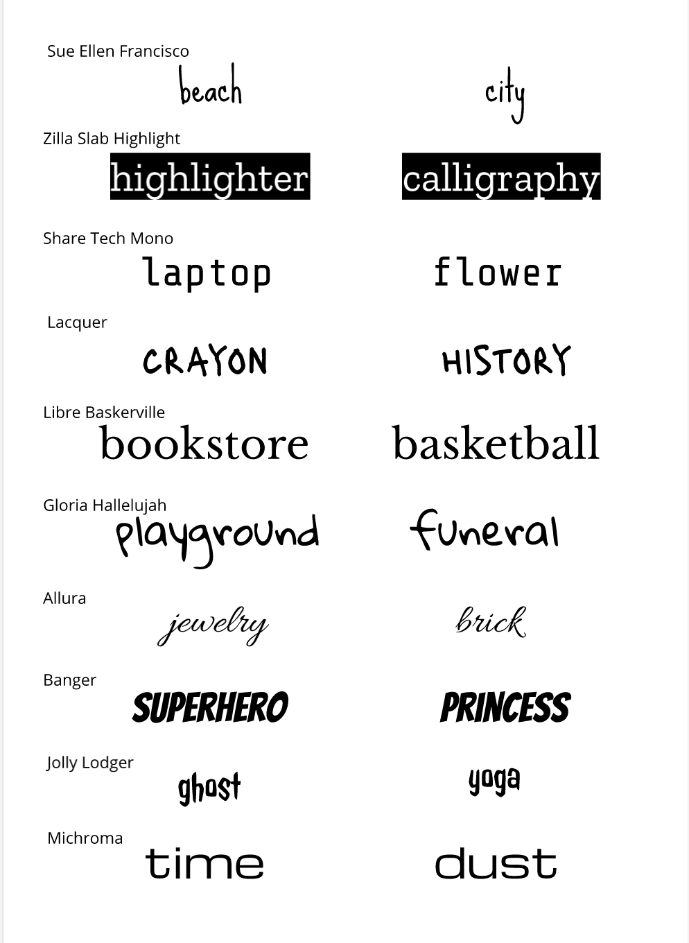 In these three exercises, I created lines and shapes using the pen tool. I learned how to use the option key, clip shapes, and click and drag lines to create curves. The pen tool is a function that allows you to create customized lines and shapes. For my final illustration, I created an image of three giraffes and a sunset. A challenge I faced when creating this image was cutting out spaces in the center of the image. To overcome this challenge, I experimented with different ways to hide the spaces, and learned to ask for help when I needed it. 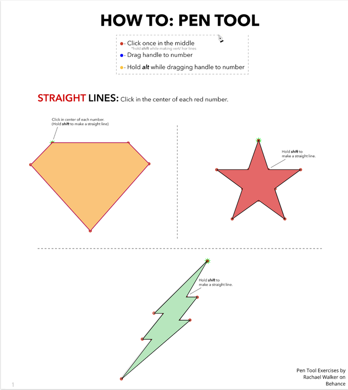 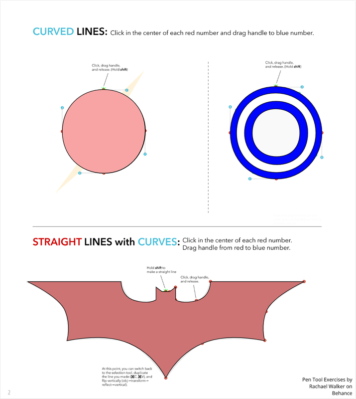 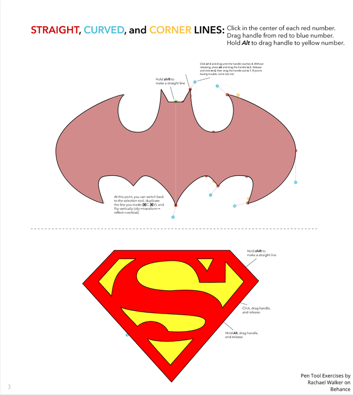 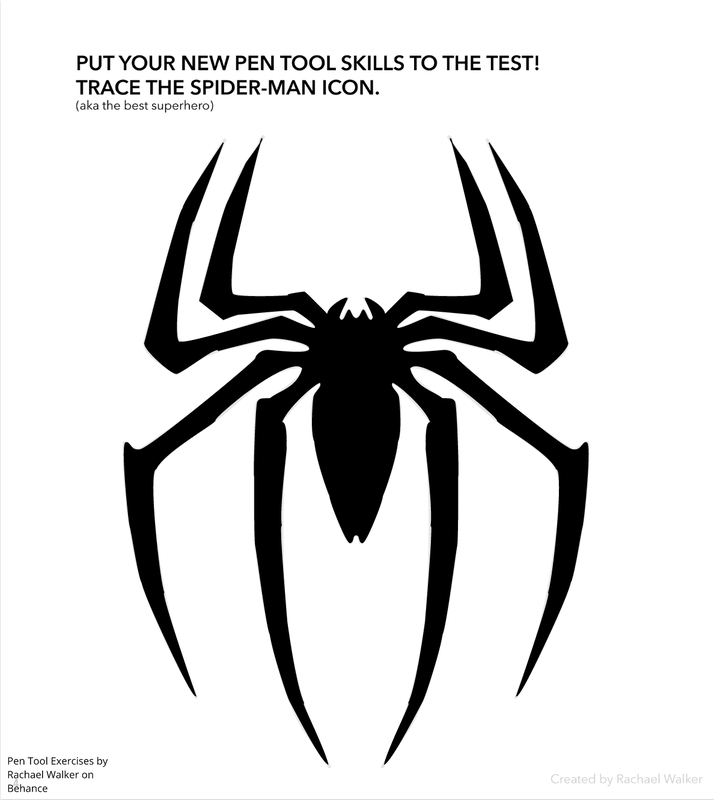 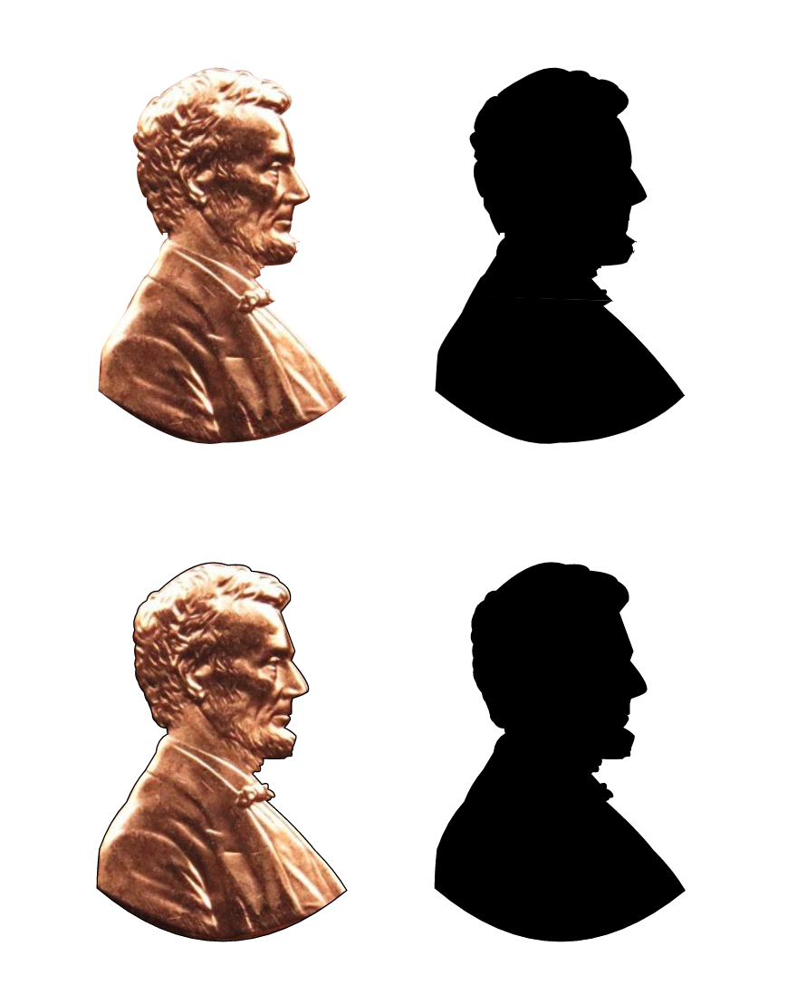 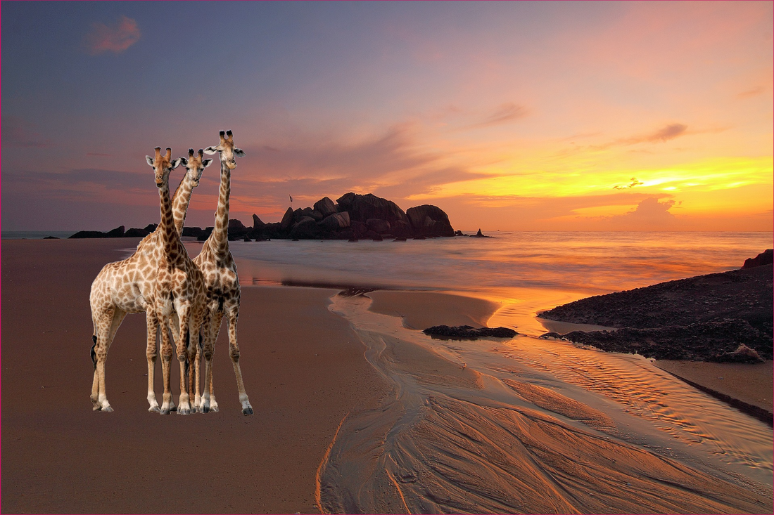 I created a landscape of a forest with mountains in the background. This illustration is meaningful to me because I have always loved spending time in nature. I am also interested in environmentalism, and preserving nature. When creating this image, I was successful in creating compound shapes, and I struggled with layering and grouping. However, I am content with the final outcome, and I think it represents me well. 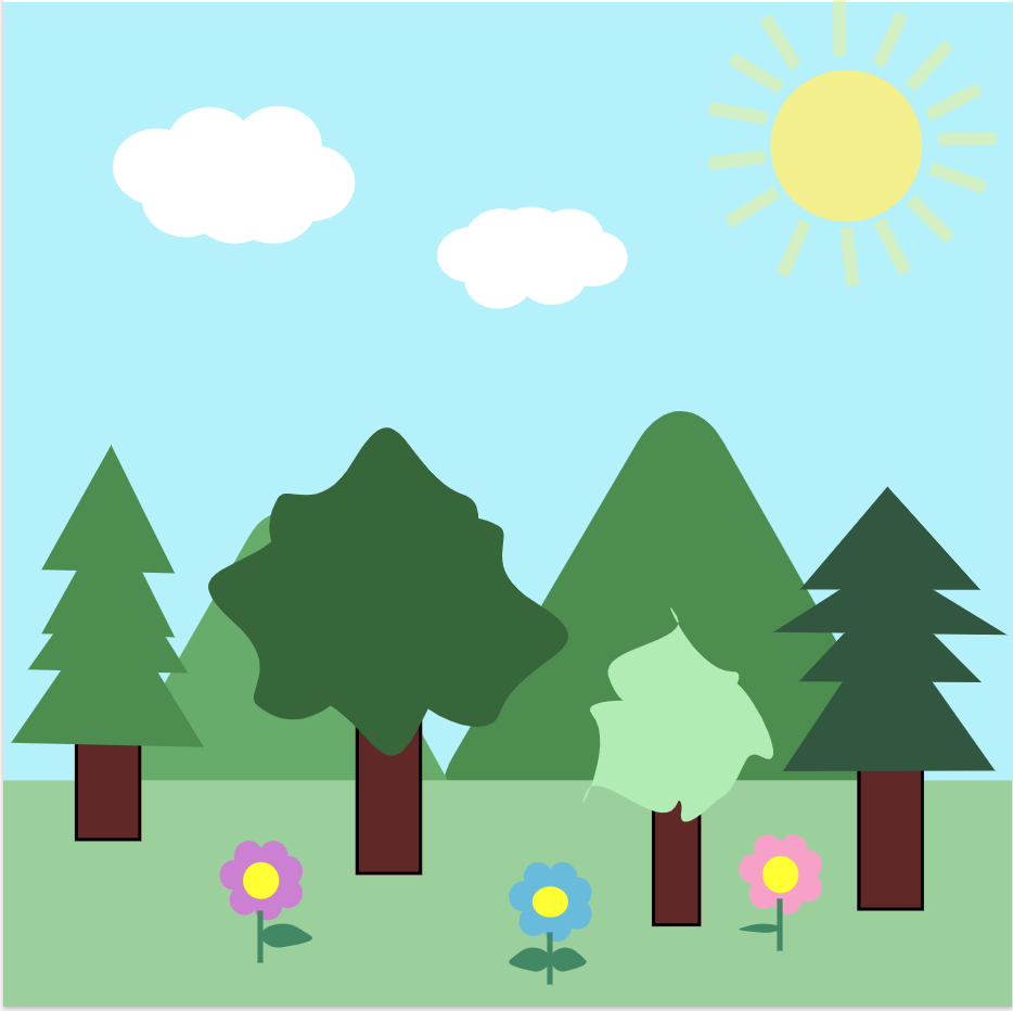 In this lesson, I learned how to create compound shapes and adjust the shape of the corners. I learned how to unite, subtract, intersect, and find the difference between shapes. 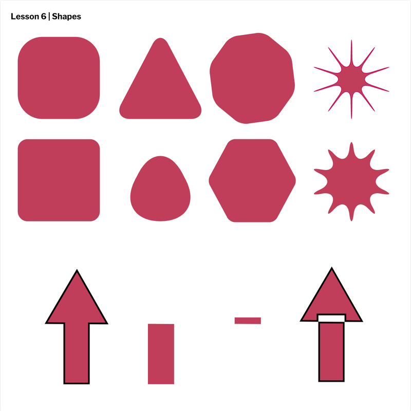 In this lesson, I learned how to layer and group shapes using keyboard shortcuts. I also learned how to align shapes to the center, right, left, up, and down. 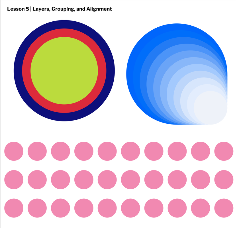 In this lesson, I learned how to adjust the size, position, and shape of objects. I also learned more about how to use the pointer tool, the subselect tool, and the shift key. 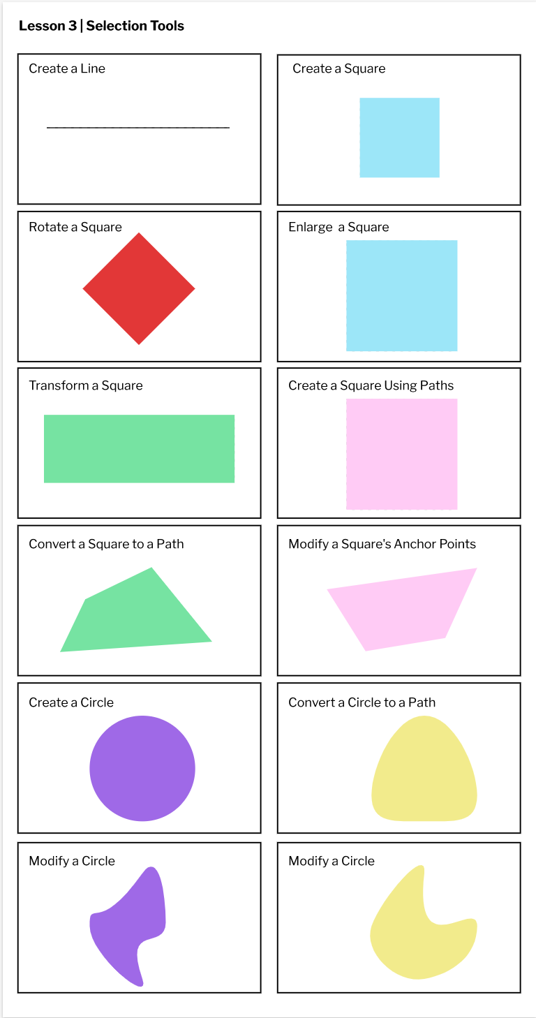 This lesson taught me how to change the color and opacity of a shape, and how to adjust the size, thickness and pattern of the borders. 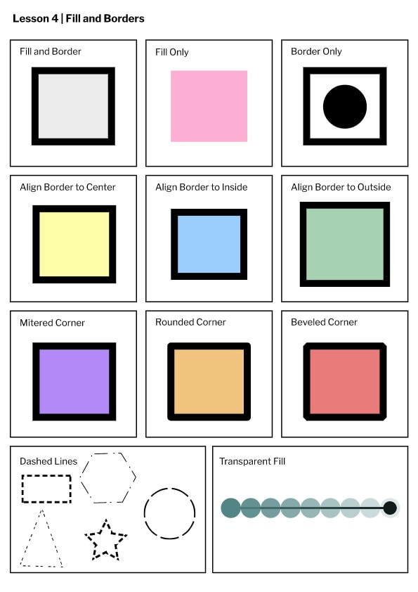 Through this assignment, I learned how to start a gravit account, and I became more familiar with some of its features such as text, and creating different pages.  I created three fruits: an apple, an orange, and grapes. I decided to make fruits because they are made up of more simple shapes, so I could really work on perfecting my code, and creating details. Through this activity, I learned how to use coding and computer programming to create digital drawings using lines, shapes, and color. This activity also taught me to persevere. Technology is not my strong suit, so I would get often frustrated when my code didn't work. However, through trial and error, I was able to finish my drawing, and this taught me to persist, even when things don't work out. khan academy link 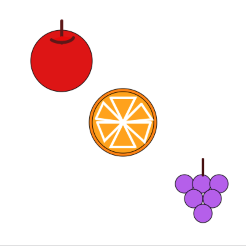 // Apple
fill(219, 21, 21); ellipse(100, 100, 100, 100); // Orange fill(255, 132, 0); ellipse(200, 200, 110, 110); fill(255, 162, 0); ellipse(200, 200, 100, 100); stroke(255, 255, 255); strokeWeight(4); triangle(220, 240, 180, 240, 200, 200); triangle(158, 200, 170, 230, 200, 200); triangle(245, 200, 235, 232, 200, 200); triangle(180, 160, 220, 160, 200, 200); triangle(156, 194, 168, 168, 200, 200); triangle(230, 170, 247, 195, 200, 200); // Grape stroke(0, 0, 0); strokeWeight(1); fill(180, 95, 237); ellipse(300, 300, 30, 30); ellipse(328, 300, 30, 30); ellipse(356, 300, 30, 30); ellipse(315, 324, 30, 30); ellipse(345, 324, 30, 30); ellipse(330, 348, 30, 30); // Grape Stem stroke(69, 15, 15); strokeWeight(4); line(330, 285, 330, 260); // Apple Stem stroke(92, 24, 24); strokeWeight(5); line(100, 70, 100, 35); fill(227, 9, 9); arc(100, 60, 40, 20, 15, 145); |
ARCHIVES
January 2021
CATEGORIES This work is licensed under a Creative Commons Attribution-NonCommercial-NoDerivatives 4.0 International License. |
